For Terroir That Travels, Genomic Gastronomy set out to visualize how foods protected under the E.U.’s Geographical Indication (GI) scheme might migrate due to climate change. These foods are linked to specific regions, local traditions, and unique terroirs, so the threat of climate change means a lot is at stake for these rural communities—both in terms of economy and heritage.
Although we love looking at maps, cartography and GIS are not skills that we have in the studio, so we worked with the map-makers Nataly Khadziakova Studio and programmer Eugene Kalinouski to create the two interactive maps featured in the Terroir That Travels project. (Thanks to them for bringing this concept to life!)
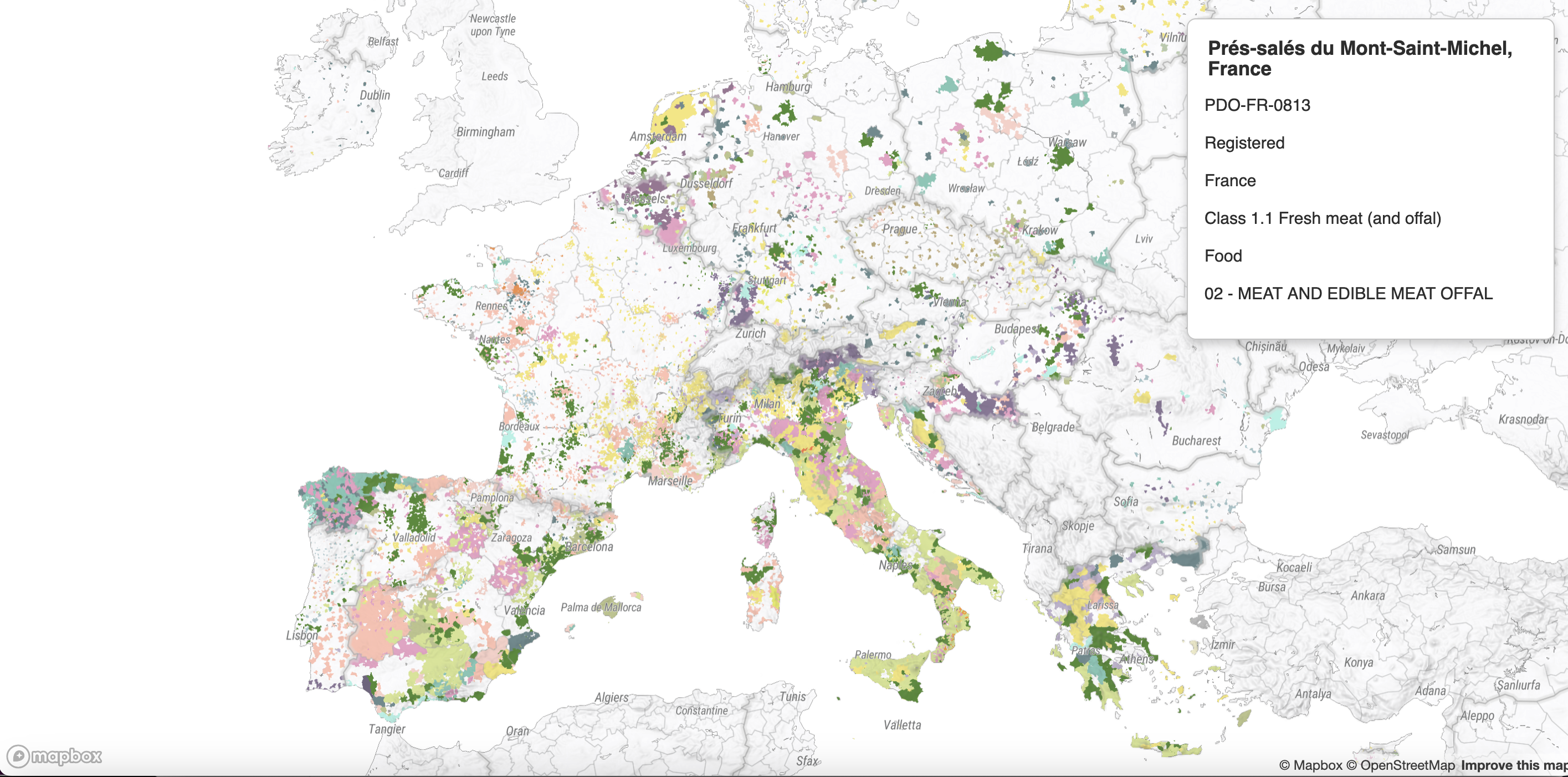
The two prototype maps feature the GI scheme’s PDO (Protected Designation of Origin and PGI (Protected Geographical Indication) products from the EU’s eAmbrosia database, which catalogs all the registered GI products:
The 2024 MAP
This map was created using AI to extract the geographic data from the EU’s eAmbrosia database. Using this geographic dataset, we created a map of existing products which can be compared or overlaid with climate predictions. As far as we know, this was the first time these thousands of registered GI products were visualized on a single map: https://datathug.github.io/terroirthattravelsmaps/
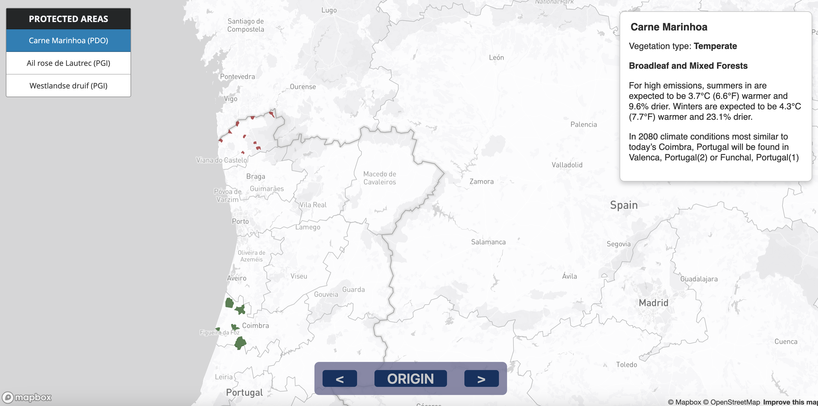
The 2080 MAP
This map shows a prediction of where three existing GI products could migrate, based on geographies that might have the necessary conditions for the product to survive. For this speculative mapping exercise, we referenced the tool “What will climate feel like in 60 years?” (https://fitzlab.shinyapps.io/cityapp/) to imagine where these food products might migrate to: https://datathug.github.io/terroirthattravelsmaps/migrations

MAKING THE 2024 MAP
When we proposed this project, we thought that extracting that GI product geographic data from the eAmbrosia dataset might not be simple, but would be straightforward, since all the products were cataloged in one place, but this proved much more difficult than we originally thought. The eAmbrosia dataset contains thousands of GI food products, and each product has a separately uploaded PDF registration sheet, written in the local language (over 20 languages), with geographic regions delineated based on local norms (not a European standard), most products had various geographic zones attributed to them, and each registration sheet was formatted differently (some even had hand-written elements).

(Above Image) Example map from GI registration document from the EU’s eAmbrosia website. Credit: European Commission eAmbrosia Union register of geographical indications
To get around these challenges, the team used OpenAI’s ChatGPT API, Python, and QGIS to identify, extract, and plot the relevant geographic data for each product, using the following basic steps:
1. Download source PDO+PGI info from eAmbrosia
2. Feed PDO+PGI info one by one to ChatGPT to get address-like locations (georeference)
3. Feed derived georeferences to Geocoder to get points for each of these locations (30K address references for initial dataset)
4. Download official geodata for EU land administration units from Eurostat’s GISCO
5. Join PDO+PGI info to communes (polygons) in QGIS based on coordinates related to each PDO + PGI
To find out more about the process check out the readme here: https://github.com/datathug/food-n-climate.
MAKING THE 2080 MAP
For the speculative map, we wanted to imagine how these GI products might migrate based on climate predictions. There are several climate models that could have been applied to these maps, but deciding on which models to use, what factors to consider as well as the translational step of then showing how each product could migrate was going to be challenging with our expertise, budget, and timeframe.
Instead, our team found an interesting reference tool from the University of Maryland Center for Environmental Science called: “What will climate feel like in 60 years?” (https://fitzlab.shinyapps.io/cityapp/). This research lab had already created a map that showed which geographic location would be most similar to another one (in terms of climate) in 60 years time. We used this tool to see where our three exemplar GI “Terroir That Travels” products might migrate to based on this research lab’s model. We contacted the lab to get more information, discuss a future collaboration, or share data, but haven’t been able to arrange a meeting yet.

(Above Image) Screenshot form “What will climate feel like in 60 years?”. Credit: University of Maryland Center for Environmental Science (https://fitzlab.shinyapps.io/cityapp/)

(Above image) Excerpt from the Terroir That Travels 2080 printed map, predicting that pink garlic might find ideal climate conditions in Oldenburg, Germany in the year 2080.
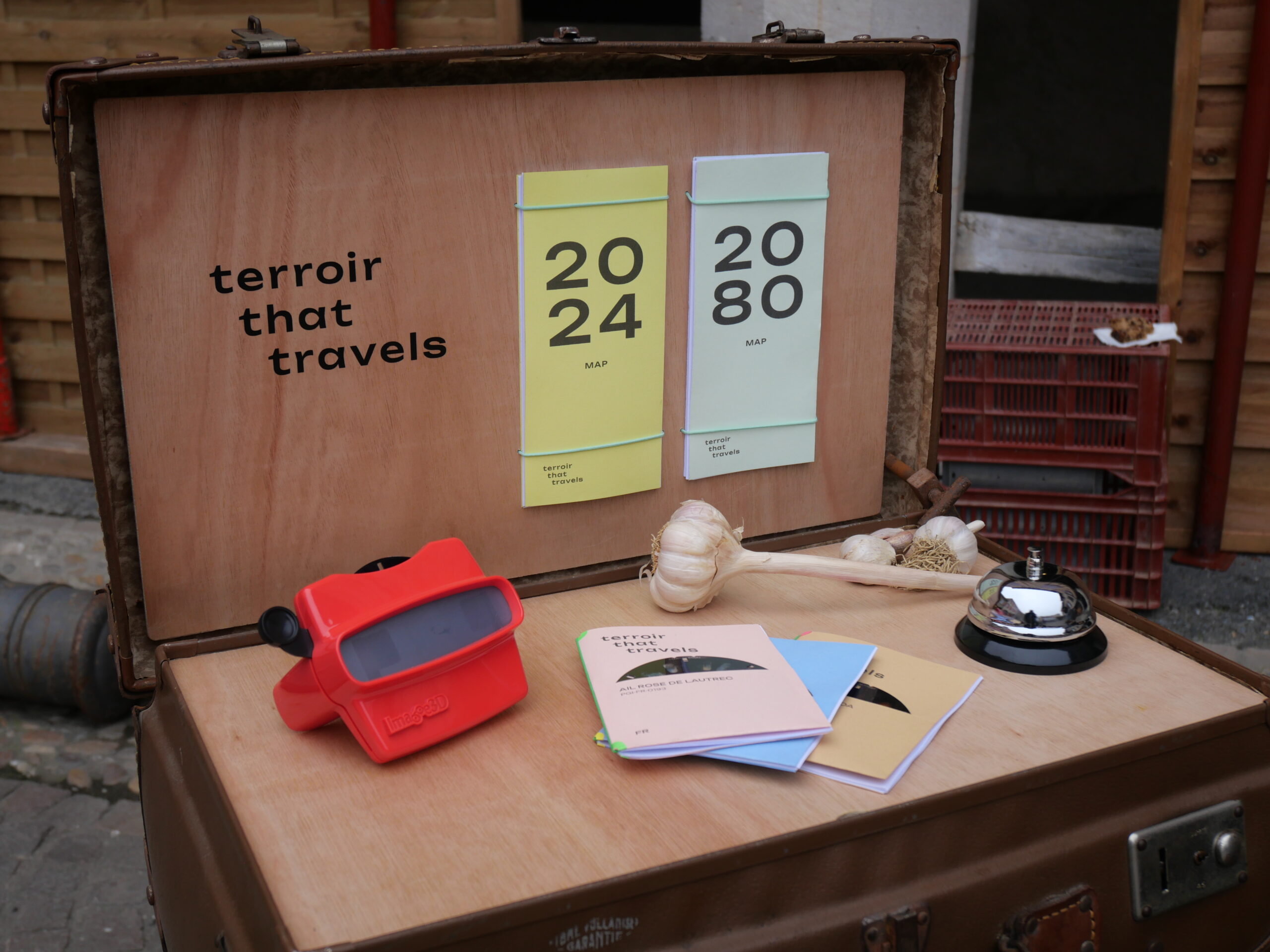
THE INSTALLATION
In the pop-up installation launched in December 2024, local agriculturalists in France were quite engaged by the “Terroir That Travels” maps. The 2080 map was particularly provocative and a good tool for debate. In future iterations of this project, we’d like to use these maps as a boundary object and conversation starter both with the local communities who maintain these GI products, and the eaters who enjoy them.

REFLECTION
For the 2080 map, we only focused on 3 data points, so we could be more specific. The purpose of this map was to show the large distance that environmental patterns will travel between now and 2080. The primary gesture was quite blunt and low fidelity: “Due to climate change, this region of Germany in 2080 will have similar climate conditions to this region of France in 2024 where pink garlic is currently grown.”
The 2024 map was a different process and outcome entirely. Creating such a complex map from a large bureaucratic dataset is a significant undertaking. Although we were able to find an analogous map of protected EU wines, we could not find any similar map for food products. (However, if anyone knows a publicly shareable map that exists, we’d love to hear!). Creating the wine map took 5 academic researchers scores of human hours and required a team whose “members were fluent in Italian, French, German, Spanish, Portuguese, and English”.
However, we thought it would be valuable to spatially assemble these food communities on one map, even if our initial version was imperfect, and had some data inaccuracies. The trade-off of using this automated process is that we were able to use the limited resources we had to get the first fuzzy snapshot (that we know of) of the EU’s GI landscape.

(Above image) printed Terroir That Travels 2024 map
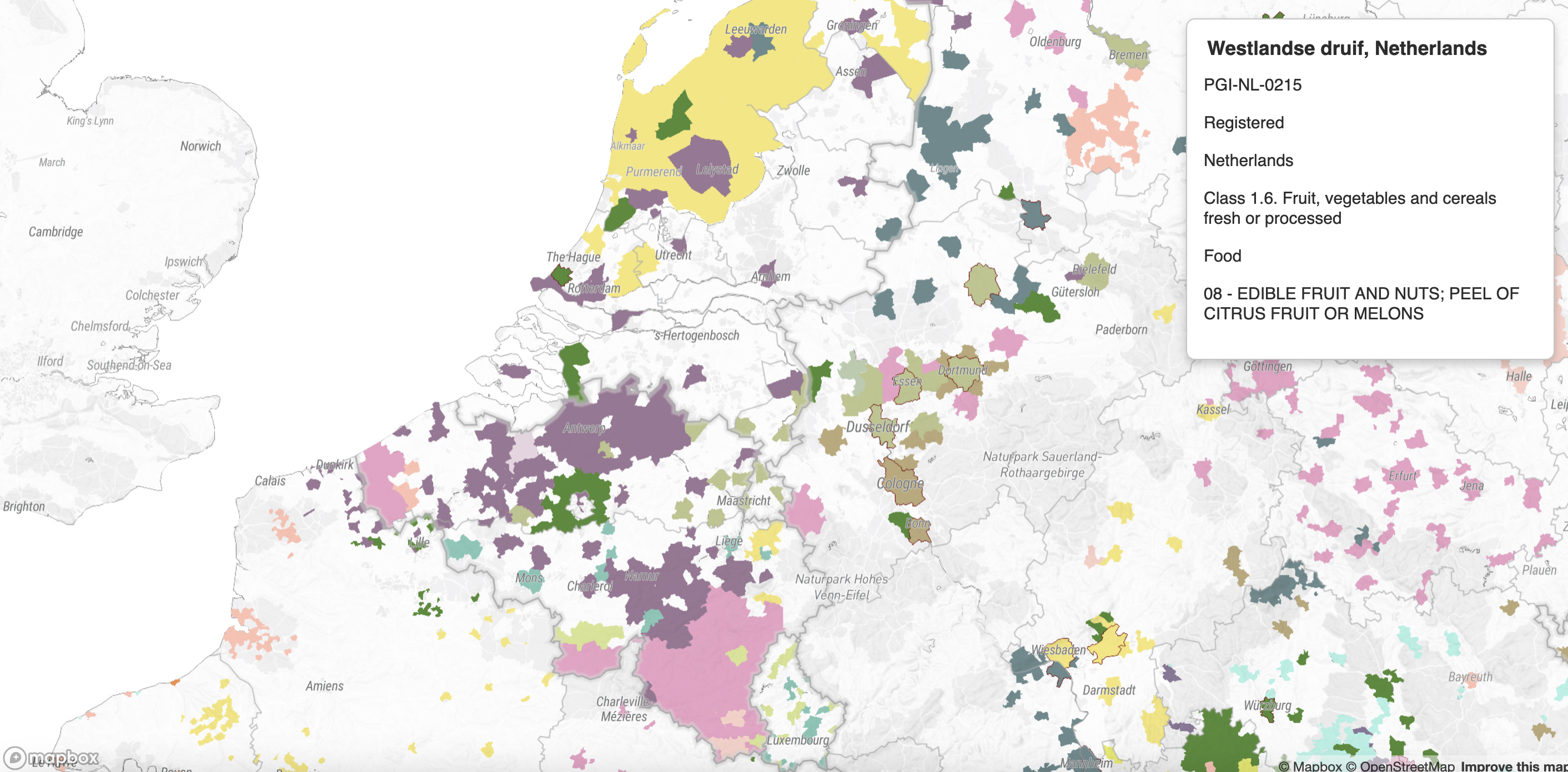
(Above image) digital/interactive Terroir That Travels 2024 map
For each PGI & PDO on our map we have provided the reference number for the official documents from which the data was created, allowing the users to visit the eAmbrosia database and see if any particular entry on the map is accurate.
We need to be clear when sharing this map that it is both a draft and an experiment, and should not be used for academic, scientific or journalistic purposes. But as an art object, it gives people a fuzzy, but powerful snapshot of the continent, and allows them to begin to ask relational or regionally specific questions. We think this has a lot of value.
If the EU’s GI Scheme (or academic researchers) made available a complete and accurate set of location files we would be very excited to use those in future mapping exercises, but hopefully the map we created through this project can be a first attempt at unifying these products for the first time as one cultural concept that ties the nations and districts together. We hope that with some edits and precision, the whole picture will continue to come into focus in the coming years, before some of these foods totally disappear or migrate completely out of their protected zones.
